
Apr 11, 2006, 21:39
hi all, I didn't know where to put this one....... (in the bin?)
tell it how you see it
![[Image: shoe.jpg]](http://www.shuttertalk.com/forums/images/upload/shoe.jpg)
tell it how you see it
|
Apr 11, 2006, 21:39
hi all, I didn't know where to put this one....... (in the bin?)
tell it how you see it

Apr 11, 2006, 21:52
I like the use of negative space at the bottom - this unusual composition puts this shot beyond snapshot.
Apr 11, 2006, 22:47
Like toad I like the composition, the thing I find most bothersome is the blurred writing on the right edge.... needs to go.

Apr 11, 2006, 23:08
No to the bin!!!
I like a lot this kind of pictures... the color of the floor and the lace looks great...!! the light is also very nice... To me what is missing is more texture in the shoe, and to have it totally in focus.... while I like a lot the light and shadow as it is, I would love to see more detail in the shoe and if it has a hole show it  ... ...I would isolate it as well... nothing in the background just a dark shadow... Splendid Russ... A work of art which did not begin in emotion is not art. Paul Cezanne 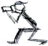
Apr 11, 2006, 23:14
I like this too. I personally think there is too much negative space on the bottom. I'd also like to see the bike tire in back a little more. Not much though. Just enough to pick it out right away.
Apr 12, 2006, 00:00
I agree with petographer about the bike, because I never thought it was a bike until I got an HDR image from your picture and the bike appeared... and I liked the idea, but then I am in two minds because I see the bike as a cluttered backgroud for a full of detail subject (shoe)...
perhaps if you had the shoe just a bit to the front so the shoe wouldn't have as a background the bike but the floor and leave the bike in the picture but a little farther? A very interesting picture to work with composition... I really like it...
A work of art which did not begin in emotion is not art. Paul Cezanne 
Apr 12, 2006, 01:02
i like the light in this too, and i think the bike behind it tells a story.
the first thing I imagined was a kid rushing to get inside for dinner and dumping the shoes and bike, leaving them strewn as they are (as kids do.) Canon 350D with Speedlight 580EX flash EFS 18-55 f/3.5-5.6 II, EF 90-300mm f/4.5-5.6 USM, EF 50mm f/1.8 http://www.inspired-images.com.au
Apr 12, 2006, 04:46
Excellent thanks all.........first sorry I didn't give the pic a title or much info to go on. The reason is I didn't want to give any preconceived thoughts. I really did have some reservations about posting this one. I put the "in the bin" line in to give me an out....
 and to make people feel easier to tell it as they see it! and to make people feel easier to tell it as they see it!For me the shot was about lighting and exposure and using that to take a poor (for want of a better word) subject and make it interesting and tell a story. I have gained a heap of info from your comments. I can see I have to be careful with the exposure with this type of shot. I knew what I was shooting, I can see now that some of you didnât get the detail needed. Irma, I think a little bigger DOF would have helped along with the exposure. On my monitor I have the detail. EB, I tossed up whether to get rid of the blurred writing but I knew what it was, (helmet) I can see now you did not have that info and it does not add anything to it. Toad, I am glad you like the use of negative space and the comp! Peto, I did already trim that neg/space backâ¦.But I can see your point on that and the background info. Schell, I got a big smile when I read your comment â¦â¦â¦..you could see a story which was one of my goalsâ¦..thanksIrma, I would be happy if you wanted to share your HDR image I never thought to give it a try. thanks again everyone I really do appreciate the feed back
Apr 12, 2006, 05:24
I left the crop as it is but I think a square crop would be fine... sorry but I am in my square crop era....
Anyway here you have... 3 exposures to lighten the shoe, I worked with photomatix and my B&W conversion in PS Channel mixer and gradient map... ![[Image: shoeHDRweb.jpg]](http://www.shuttertalk.com/forums/images/upload/shoeHDRweb.jpg)
A work of art which did not begin in emotion is not art. Paul Cezanne
Apr 12, 2006, 07:29
I like Irma's version very much. I still thing there is way too much space at the bottom though, but I must say I am most inspired to try something very similar. Stay tuned!

Apr 12, 2006, 08:12
I like the first MUCH better than the edited version! the contrast is an important part of the atmosphere! the light is outstanding.
I would probably cut an inch or so off the bottom, maybe less. I appreciate the depth that the negative space gives, particulartly as it is not just black but a gradient, but for my personal taste, it's a bit too much. It's a great picture, looks like it tells a story! uli 
Apr 12, 2006, 10:07
I got an impression of the aftermath of a bike disaster/crash. A bit morbid. Just needs a body, or a bloodied hand..
Lumix LX5. Canon 350 D.+ 18-55 Kit lens + Tamron 70-300 macro. + Canon 50mm f1.8 + Manfrotto tripod, in bag.
Apr 12, 2006, 16:57
Quote:On my monitor I have the detail.Did I say that........wow Irma, now yours has detail.. Thanks for taking the time to do that. I'm happy to see your take on my pitcure......it gives me more idea's. I understand where your comming from with your comment on giving the shoe more space between it and the bike. Uli, I am glad you like the lighting..........I am happy too because I didn't do much PPing to get the results I was after. Just changed the colour temp (too warm) and played with brightness and contrast. NT, I like the story you saw in the picture........(showing your dark side ) i thought later some fake blood would be nice :o (showing my dark side) but that would be me telling the story. The idea was for the viewer to see their own. Now we have ruined it for Schell :|Thanks again for all your comments and Irma your work! I thought I would get something like "whats this bloke taking pictures of a shoe for" cheers
Apr 12, 2006, 18:07
hey,
who remembers Stephen King's Pet Cemetary?! Just thought of that, looking at the shoe again...
Apr 12, 2006, 18:56
This image works for me.
The photograph has a great story. To me, this feels like the back shed, where last summer's things were left at the end of the season, discarded where they lay. Now, light's shining on them again; summer's near and old interests are returning. I can hear the creaking door sliding open; or perhaps the time isn't quite ready, and the sun's coming through a small utility window, and everything is still and waiting. It combines melancholy, nostalgia, and promise. I love the shoe, and like the bike. To me the bike is needed to tell the story. I don't like the bright OOF lettering; it's too prominent without adding any further information to the image. You need the negative space, and I like the subject being placed at the top 1/3 line, but the way it was done isn't my favourite. It looks artificial. It needs to be a shadow, or something organic and native to the photo. The colour shift (to green on my monitor) at the edge also is distracting. Finally, while I appreciate that the shot works despite/because-of being underexposed, there's a lot more 'pop' to be had in the shoe. Try creating a "levels" adjustment layer to spread out the histogram, and then masking out everything but the shoe. Please don't take this the wrong way; the more I like an image the more I nitpick at it. Now I'm off to read the other comments... matthewpiers.com • @matthewpiers | robertsonphoto.blogspot.com | @thewsreviews • thewsreviews.com
Apr 12, 2006, 19:13
I've read the thread, so now I'm back.
Sorry, Irma, but I'm with Uli and prefer the original. I like its subtlety. As for detail, I wouldn't say that the shot is exceptionally sharp, but I do see sufficient shadow detail in the background. I use an LCD monitor, and this does tend to show lighter blacks, so this may not be universal. Russ, I see that you said you didn't do much PP work. I was assuming that the foreground was darkened during development; I still think it looks artificial. (Even if it isn't.) Is there perhaps some green translucent fiberglass nearby? I still think it needs a defined, natural-looking shadow to match the shadow behind the shoe. Russt Wrote:... but that would be me telling the story. The idea was for the viewer to see their own.Sometimes photos are easier to critique when they're presented with a statement and background to the image. This one wouldn't be, for exactly the reason you've stated. Sometimes we need to go in 'cold', and have the image succeed or fail on its own. Thanks for giving me something to think about. matthewpiers.com • @matthewpiers | robertsonphoto.blogspot.com | @thewsreviews • thewsreviews.com
Apr 12, 2006, 22:38
Matt, I don't see you critique as nitpicking at all.....I appreciate the time and thought you put into it. I enjoyed your story on the shot and in particular how you saw the light. I don't expect everyone to like it........I am just lucky you all share the hobby and can see beyond just a pic of a shoe........(I wonder what the average Joe would say :/)
The light and the under exposure were the key.........I read Kombi's article which prompted me to play around with what lights I have at home. I do feel I needed a brighter light so to pick up more of the highlights. Having said that you are right with some more PPing I could have got more pop out of the subject, I think Irma's version shows that! Its good to hear you saw enough of the bike........that was the idea, just to give a clue to a story. The green I can see too, I think that has come from my adjustment of the colour temp and tint. I must say I have learned as much from all the comments as I did taking the shot. thanks
« Next Oldest | Next Newest »
Possibly Related Threads…
Thread / Author
Replies
Views
Last Post
Users browsing this thread: 1 Guest(s) |