
Jul 23, 2005, 11:05
This method for converting color photographs to black & white in Photoshop is a combination of methods I have found on the web, including the DigiDaan channel mixer , Russell Brown film/filter, and Petteri Sulonen emulation methods.
While there are many methods and free Photoshop actions available for converting color photos to B&W, I find this method gives me ample control and high quality results. As with all things, your own mileage may vary.
For my own use, I have made actions comprised of the following steps:
First, duplicate the original processed image so you are not working on your original: Image > Duplicate.
Now make an adjustment layer using the Channel Mixer, by selecting Layer > New Adjustment Layer > Channel Mixer. In the Name field, enter BW Film and click OK. In the Channel Mixer dialog box, check the Monochrome box at the bottom, and the enter the following: Red 25%, Green 35%, Blue 40%.
![[Image: channelmix.jpg]](http://www.shuttertalk.com/forums/images/upload/channelmix.jpg)
Note that any combination of red, green and blue is okay, as long as the numbers add up to around 100%. The above settings came from Petteriâs Tri-X emulation. His Ilford emulation uses Red 28%, Green 41%, Blue 31%, and I personally like this one better for skin tones. DigiDaanâs ânormal contrastâ settings are Red 43%, Green 33%, Blue 30% - note that these add up to more than 100%, but the overall result is very good if you donât want to do much more processing for contrast.
Next is an optional step, adding a tint layer. The idea behind this is that some B&W films have a very slight tint to them, and we can easily replicate this tint in Photoshop. Keeping with Petteriâs Tri-X settings, we select Layer > New Adjustment Layer > Hue/Saturation. Name this layer BW Tint, and change the Mode box to Color, then click OK. In the Hue/Saturation dialog box, enter Hue 23, Saturation 50, and check the Colorize option.
![[Image: huesat1.jpg]](http://www.shuttertalk.com/forums/images/upload/huesat1.jpg)
Click OK. The image will now have an orange cast, but we are going to minimize this in the next step. In the Layers palette, make sure the BW Tint layer is selected, then change the layerâs opacity to 3%. This will now give just a hint of warmth to the image, which you can see by toggling the layer on and off.
Now letâs incorporate Russell Brownâs âfilterâ concept. This is an attempt to replicate the effect of a color filter used in combination with B&W film, a common technique for adjusting contrast in-camera.
Select your background layer, and then make another hue/saturation adjustment layer (Layer > New Adjustment Layer > Hue/Saturation.) When the layer dialog opens, enter Color Filter as the name, and once again change the mode to Color, then click OK. This is the most powerful step in the process, as you can bring about some dramatic changes to your imageâs tonal range. Remember, a little goes a long way! I start by setting Saturation to 5 and Hue to -15, which I find gives pleasant skin tones and opens up the shadows a bit.
![[Image: huesat2.jpg]](http://www.shuttertalk.com/forums/images/upload/huesat2.jpg)
For higher contrast you might want a green filter, so simply move your hue slider to the right, until the lower color bar has green in the middle. For example:
![[Image: huesat3.jpg]](http://www.shuttertalk.com/forums/images/upload/huesat3.jpg)
See how dramatically your image changes with this different âfilterâ? Experiment with different hue and saturation settings until you find something appropriate for your image.
Next weâll make a final adjustment to the overall contrast, using another adjustment layer. This time weâll use a Curves layer: Layer > New Adjustment Layer > Curves. Set the Name to âContrastâ and change the mode to Luminosity so that we avoid shifting the colors. I start with a default S-curve that is fairly modest, and I adjust it to taste depending on the image:
![[Image: 74_curve.jpg]](http://www.shuttertalk.com/forums/images/upload/74_curve.jpg)
For my defaults, I set four points on the curve, then I make changes as necessary:
1. Input 0, Output 5 so that I do not print a pure black
2. Input 64, Output 60 to deepen the lower end of my midtones
3. Input 191, Output 195 to brighten the higher end of my midtones
4. Input 255, Output 250 to avoid printing pure white
My main conversion actions stop there, because 80% of the time I find the images donât need much more work than that. Sometimes I will add a grain layer, and other times I will use Petteriâs âsoft light and dodgeâ method to fine tune the contrast.
My favorite trick is to make a simple blurred soft light layer, which adds contrast with a touch of diffusion and gives the image a âwetâ look. Iâve created a separate action for this, which I call âMood Light,â and I run it after Iâve finished the above steps.
First, make sure that the topmost layer is selected in your layers palette. (If you followed all the steps above, this will be your BW Tint layer.)
Create a new layer (Layer > New > Layer), set the name as Mood Light and click OK.
Now we want to âstampâ all of the layers into our new layer. In Windows, you need to press Shift + Alt + Ctrl + E, or you can hold down the Alt key and select Layer > Merge Visible. (On a Macintosh, use Option and Command in place of Alt and Ctrl.) All visible layers will now be merged into the new layer at the top of the palette.
Change the new layer mode to Soft Light in the drop-down box at the top of the layer palette, and set opacity to 50%. Next, blur the soft light layer with Filter > Blur > Gaussian Blur, and adjust the setting to your preference. I like more diffusion, and on a 6mp image I start at a 30 pixel blur.
Hopefully you can tell the difference in these small images:
Color::
![[Image: maddie-color.jpg]](http://www.shuttertalk.com/forums/images/upload/maddie-color.jpg)
BW "Tri X" conversion:
![[Image: maddie-bw1.jpg]](http://www.shuttertalk.com/forums/images/upload/maddie-bw1.jpg)
BW w/ Mood Light:
![[Image: maddie-bw2.jpg]](http://www.shuttertalk.com/forums/images/upload/maddie-bw2.jpg)
I hope that is helpful!
While there are many methods and free Photoshop actions available for converting color photos to B&W, I find this method gives me ample control and high quality results. As with all things, your own mileage may vary.
For my own use, I have made actions comprised of the following steps:
First, duplicate the original processed image so you are not working on your original: Image > Duplicate.
Now make an adjustment layer using the Channel Mixer, by selecting Layer > New Adjustment Layer > Channel Mixer. In the Name field, enter BW Film and click OK. In the Channel Mixer dialog box, check the Monochrome box at the bottom, and the enter the following: Red 25%, Green 35%, Blue 40%.
Note that any combination of red, green and blue is okay, as long as the numbers add up to around 100%. The above settings came from Petteriâs Tri-X emulation. His Ilford emulation uses Red 28%, Green 41%, Blue 31%, and I personally like this one better for skin tones. DigiDaanâs ânormal contrastâ settings are Red 43%, Green 33%, Blue 30% - note that these add up to more than 100%, but the overall result is very good if you donât want to do much more processing for contrast.
Next is an optional step, adding a tint layer. The idea behind this is that some B&W films have a very slight tint to them, and we can easily replicate this tint in Photoshop. Keeping with Petteriâs Tri-X settings, we select Layer > New Adjustment Layer > Hue/Saturation. Name this layer BW Tint, and change the Mode box to Color, then click OK. In the Hue/Saturation dialog box, enter Hue 23, Saturation 50, and check the Colorize option.
Click OK. The image will now have an orange cast, but we are going to minimize this in the next step. In the Layers palette, make sure the BW Tint layer is selected, then change the layerâs opacity to 3%. This will now give just a hint of warmth to the image, which you can see by toggling the layer on and off.
Now letâs incorporate Russell Brownâs âfilterâ concept. This is an attempt to replicate the effect of a color filter used in combination with B&W film, a common technique for adjusting contrast in-camera.
Select your background layer, and then make another hue/saturation adjustment layer (Layer > New Adjustment Layer > Hue/Saturation.) When the layer dialog opens, enter Color Filter as the name, and once again change the mode to Color, then click OK. This is the most powerful step in the process, as you can bring about some dramatic changes to your imageâs tonal range. Remember, a little goes a long way! I start by setting Saturation to 5 and Hue to -15, which I find gives pleasant skin tones and opens up the shadows a bit.
For higher contrast you might want a green filter, so simply move your hue slider to the right, until the lower color bar has green in the middle. For example:
See how dramatically your image changes with this different âfilterâ? Experiment with different hue and saturation settings until you find something appropriate for your image.
Next weâll make a final adjustment to the overall contrast, using another adjustment layer. This time weâll use a Curves layer: Layer > New Adjustment Layer > Curves. Set the Name to âContrastâ and change the mode to Luminosity so that we avoid shifting the colors. I start with a default S-curve that is fairly modest, and I adjust it to taste depending on the image:
For my defaults, I set four points on the curve, then I make changes as necessary:
1. Input 0, Output 5 so that I do not print a pure black
2. Input 64, Output 60 to deepen the lower end of my midtones
3. Input 191, Output 195 to brighten the higher end of my midtones
4. Input 255, Output 250 to avoid printing pure white
My main conversion actions stop there, because 80% of the time I find the images donât need much more work than that. Sometimes I will add a grain layer, and other times I will use Petteriâs âsoft light and dodgeâ method to fine tune the contrast.
My favorite trick is to make a simple blurred soft light layer, which adds contrast with a touch of diffusion and gives the image a âwetâ look. Iâve created a separate action for this, which I call âMood Light,â and I run it after Iâve finished the above steps.
First, make sure that the topmost layer is selected in your layers palette. (If you followed all the steps above, this will be your BW Tint layer.)
Create a new layer (Layer > New > Layer), set the name as Mood Light and click OK.
Now we want to âstampâ all of the layers into our new layer. In Windows, you need to press Shift + Alt + Ctrl + E, or you can hold down the Alt key and select Layer > Merge Visible. (On a Macintosh, use Option and Command in place of Alt and Ctrl.) All visible layers will now be merged into the new layer at the top of the palette.
Change the new layer mode to Soft Light in the drop-down box at the top of the layer palette, and set opacity to 50%. Next, blur the soft light layer with Filter > Blur > Gaussian Blur, and adjust the setting to your preference. I like more diffusion, and on a 6mp image I start at a 30 pixel blur.
Hopefully you can tell the difference in these small images:
Color::
BW "Tri X" conversion:
BW w/ Mood Light:
I hope that is helpful!
_______________________________________
Everybody got to elevate from the norm!


 Many Thanks, Mitch!!
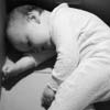

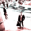


![[Image: 29_original.jpg]](http://www.shuttertalk.com/forums/images/upload/29_original.jpg)
![[Image: bw%20conversion.jpg]](http://www.shuttertalk.com/forums/images/upload/bw%20conversion.jpg)