Please Help this picture ( everyone )
Posts: 1,184
Threads: 174
Joined: Jul 2005
Reputation:
0
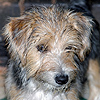
Hey yall this is one of my favorite photos that i have shot. this is my 2 babies , so be kind.. I really like the picture but want it to " POP"!! . I did a little to it and want to see some of the cool stuff yall can do. I am so new to PS that i have no idea of what all can be done ......
The picture is big ( maybe a little too big ) but yall know more about that stuff then i do.
![[Image: Faith-and-Will2.jpg]](http://www.shuttertalk.com/forums/images/upload/Faith-and-Will2.jpg)
Thanks, Shawn............
Canon 20d and a few cheap lenses ..
It is our job as photographers to show people what they saw but didnt realize they saw it ......
Posts: 454
Threads: 52
Joined: Oct 2004
Reputation:
0
Hi Shawn,
I had a quick play with it and came up with this:
![[Image: Faith-and-Will2%20copy.jpg]](http://www.shuttertalk.com/forums/images/upload/Faith-and-Will2%20copy.jpg)
I'm sure though that there are plenty of others that can do a better job than I have!
Just for the record, I found the background a problem as it seemed a little blown out top right and too close to the young lady's skin colour, so I selected it and took the levels down and reduced the sturation. (Maybe I ought to have blurred it a little too, but didn't thik at the time).The dog seemed underexposed, so I boosted the dynmaic range on him. Then I adjusted levels again for the whole picture, used the highlight and shadow tool to bring the shadows up a little more, adusted the hue slightly as I found it too pink, increased saturation a tad, and then sharpened with smart sharpen and usm before saving and uploading. Might be all abit overdone now though 
Jan 
Posts: 3,620
Threads: 235
Joined: Aug 2004
Reputation:
0
Hi Shawn. Great shot for this forum. I found the dog very difficult to do anything with. Because it is a scanned image when trying to bring out any detail too many reflections come out. However, the rest of the image took on some fairly good results from a simple contrast boost to get rid of the cloudy look and some sharpening. I added a dark border fade to help reduce distracting elements in the photo and to help to focus more on the faces.
![[Image: 23_Faith-and-Will2.jpg]](http://www.shuttertalk.com/forums/images/upload/23_Faith-and-Will2.jpg)
Sit, stay, ok, hold it! Awww, no drooling! :O
My flickr images
Posts: 5,148
Threads: 479
Joined: Oct 2004
Reputation:
1
Lovely picture to work with, Shawn...
I went for a light sepia... IMO the colors are not matching and the background a bit distracting... I think the conversion would look a bit better with the original file...
Hope you like it.
![[Image: Faith-and-Will2sepia.jpg]](http://www.shuttertalk.com/forums/images/upload/Faith-and-Will2sepia.jpg)
A work of art which did not begin in emotion is not art.
Paul Cezanne
Posts: 1,184
Threads: 174
Joined: Jul 2005
Reputation:
0
Thanks to you all , They are all great. and give me an idea on something to play with.
I really HATE the background ( but it was free and its all that i have for the moment ) . It is very " see through " and i cant seem to put anything behind it that helps. The wall is kinda white and i am having a hard time gettin it right.
I think that i will play somemore with the photo and see what else i can come up with . Thanks again.
Anyone else???
Thanks, Shawn
Canon 20d and a few cheap lenses ..
It is our job as photographers to show people what they saw but didnt realize they saw it ......
(This post was last modified: Oct 6, 2005, 19:06 by synthetik.)
Posts: 1,097
Threads: 90
Joined: Jul 2005
Reputation:
0
Here's my go Drake...
![[Image: Faith-and-Will2copy.jpg]](http://img.photobucket.com/albums/v713/schellamo/Faith-and-Will2copy.jpg)
Its such a lovely photo!
Canon 350D with Speedlight 580EX flash
EFS 18-55 f/3.5-5.6 II, EF 90-300mm f/4.5-5.6 USM, EF 50mm f/1.8
http://www.inspired-images.com.au
(This post was last modified: Oct 6, 2005, 22:11 by Graceology.)
Posts: 5,148
Threads: 479
Joined: Oct 2004
Reputation:
1
Splendid Schell! I like it a lot!! Great work you did on this picture... Your idea of the frame is great!! Could you share how you manage to get rid of the milky colors ? I couldn't get them right... As you said this picture is really lovely, and I would like to try again...
A work of art which did not begin in emotion is not art.
Paul Cezanne
Posts: 9,731
Threads: 1,965
Joined: May 2004
Reputation:
6
I really like what everone has done, but Michelle, yours seems the clearest!
If we could get the same clarity in colour, I think it would be awesome too!
Posts: 992
Threads: 138
Joined: Nov 2004
Reputation:
0
hi everyone
i really like what shell, nice work!!!
this is my try
![[Image: Faith-and-Willn2.jpg]](http://www.shuttertalk.com/forums/images/upload/Faith-and-Willn2.jpg)
regards
Christian
Posts: 5,148
Threads: 479
Joined: Oct 2004
Reputation:
1
Oh God!! Mine is ugly... I don't like it anymore....
I will try again...
Edit...
Hey Christian... what did you do to get detail in the dog??
A work of art which did not begin in emotion is not art.
Paul Cezanne
(This post was last modified: Oct 7, 2005, 02:28 by Kerridwyn.)
Posts: 1,097
Threads: 90
Joined: Jul 2005
Reputation:
0
Irma, hereâs what I didâ¦
â¢First thing, a levels adjustment
â¢Then I corrected the flared part of the bd. Layer>duplicate, then Image>adjustments>selective colour. I turned up the greens, blues and reds. Then I erased the girl and dog back in. then flatten.
â¢I lassoed her smiled, and again used selective colour>white> turned down the yellow a tad.
â¢I lassoed her eyes (hold down shift to get both in the same selection) and increased the contrast.
â¢Then I used the OpticVerve plug-in (on a separate layer) I think it was the diffuse or halo effect and then lowered the layer opacity to about 30%. Then flatten
â¢For the frame, I duplicated the layer again, did a 30.0 gaussian blur on the bottom layer, then pressed Ctrl-T to make the top layer smaller (Edit> free transform). Then used a crayon type eraser tool to soften the edges and make it look like teared paper. Then right click the layer, select blending options and add a shadow and bevel/emboss. Then did the same on the bottom layer.
â¢For the B&W I used Mitchâs method of conversion (for which Iâve made an action- if anyone wants a copy you can PM or email me) but I turned off the contrast and soft lighting and I turned up the tint.
Here is my version before the conversion...
![[Image: Faith-and-Will2.jpg]](http://img.photobucket.com/albums/v713/schellamo/Faith-and-Will2.jpg)
Canon 350D with Speedlight 580EX flash
EFS 18-55 f/3.5-5.6 II, EF 90-300mm f/4.5-5.6 USM, EF 50mm f/1.8
http://www.inspired-images.com.au
Posts: 454
Threads: 52
Joined: Oct 2004
Reputation:
0
Had another go! Got rid of the milkinss, but maybe now it's a bit harsh? That can easily be corrected though as it's mostly over enthusiastic sharpening!! (Typical of me  ).
![[Image: Faith-and-Will2b.jpg]](http://www.shuttertalk.com/forums/images/upload/Faith-and-Will2b.jpg)
--NN
Posts: 5,148
Threads: 479
Joined: Oct 2004
Reputation:
1
Both look great!! The color one looks superb as well... In the original I really didn't like the colors... you brighten them up and it lookes great... I have to try...
Thanks Schell...
A work of art which did not begin in emotion is not art.
Paul Cezanne
Posts: 454
Threads: 52
Joined: Oct 2004
Reputation:
0
Last attempt:
![[Image: Faith-and-Will2c.jpg]](http://www.shuttertalk.com/forums/images/upload/Faith-and-Will2c.jpg)
--NN
Posts: 5,148
Threads: 479
Joined: Oct 2004
Reputation:
1
Very nice NN.... you are right you don't have that milky color anymore... I like the colors you got as well...
Girls... you are doing beautiful things... I have to try again... definitely...
A work of art which did not begin in emotion is not art.
Paul Cezanne
Posts: 3,694
Threads: 243
Joined: Oct 2004
Reputation:
11
Great work Schell, I love your effort, almost looks like an emulsion transfer.
Posts: 1,184
Threads: 174
Joined: Jul 2005
Reputation:
0
I think they are all great !!! Irma yours isnt ugly , mine would get that responce after seeing all of these.
I know now that i have A LOT more to learn about PS then i thought at first. Great Job yall
Canon 20d and a few cheap lenses ..
It is our job as photographers to show people what they saw but didnt realize they saw it ......
(This post was last modified: Oct 7, 2005, 15:30 by synthetik.)
Posts: 1,097
Threads: 90
Joined: Jul 2005
Reputation:
0
Thanks everyone for your positive comments *blush*
I love your final result too NN!
Bob- I'm afraid I don't even know what an emulsion transfer is  but thankyou anyway.
Drake- don't worry, we've all been there, it just takes time! Plus, you've got some nice friendly people here to share their secrets with you! my advice- just play. if it looks bad, just use the history palatte to undo!
Canon 350D with Speedlight 580EX flash
EFS 18-55 f/3.5-5.6 II, EF 90-300mm f/4.5-5.6 USM, EF 50mm f/1.8
http://www.inspired-images.com.au
Posts: 9,731
Threads: 1,965
Joined: May 2004
Reputation:
6
Like your last attempt NN! Milkiness is definitely gone and I love the punch of the colours...
Just a suggestion - perhaps try dodging the hand in front of the dog - that's a bit white from the flash...
Posts: 1,184
Threads: 174
Joined: Jul 2005
Reputation:
0
shuttertalk Wrote:Like your last attempt NN! Milkiness is definitely gone and I love the punch of the colours...
Just a suggestion - perhaps try dodging the hand in front of the dog - that's a bit white from the flash...
the main reason the hand is infront of the dog is , he is "MY" dog and kept on running to me ( he thought that i was tryin to play with him ). He listens to me except when he is front of a camera ( go figure ) :o
Canon 20d and a few cheap lenses ..
It is our job as photographers to show people what they saw but didnt realize they saw it ......
(This post was last modified: Oct 10, 2005, 17:36 by synthetik.)
Posts: 9,731
Threads: 1,965
Joined: May 2004
Reputation:
6
Banded Drake Wrote:shuttertalk Wrote:Like your last attempt NN! Milkiness is definitely gone and I love the punch of the colours...
Just a suggestion - perhaps try dodging the hand in front of the dog - that's a bit white from the flash...
the main reason the hand is infront of the dog is , he is "MY" dog and kept on running to me ( he thought that i was tryin to play with him ). He listens to me except when he is front of a camera ( go figure ) :o
Whoops, bit of a miscommunication methinks. By "dodging", I meant: to selectively darken the highlights so that it's more evenly coloured/lit...
Nothing wrong with the placement of the hand...
Posts: 1,184
Threads: 174
Joined: Jul 2005
Reputation:
0
LOL , see i told yall i didnt know all the terms on here .
Not a problem ST
Canon 20d and a few cheap lenses ..
It is our job as photographers to show people what they saw but didnt realize they saw it ......
Posts: 23
Threads: 2
Joined: Dec 2005
Reputation:
0
I see it's been a couple months since anyone posted here, so hopefully someone sees this
![[Image: girldog2.jpg]](http://www.shuttertalk.com/forums/images/upload/girldog2.jpg)
I blurred the background, then changed the hue and saturation to create more definition between the girl and the background. Then I took another copy of the photo and erased the background. I then put that layer on top.
Posts: 9,731
Threads: 1,965
Joined: May 2004
Reputation:
6
Good job... I like the vibrant colours. I see you've done some work with the background too... much better!
Posts: 1,716
Threads: 125
Joined: Aug 2004
Reputation:
0
Nice work Stargazer. Welcome to ST.
_______________________________________
Everybody got to elevate from the norm!
Possibly Related Threads…
Thread / Author
Replies
Views
Last Post
Users browsing this thread: 1 Guest(s)
|